If your lead gen reporting feels like cooking the same meal every day, you're not alone. Most marketing teams still stitch together google ads, Meta, LinkedIn, GA4, and CRM numbers by hand, then argue about what's “real.”
A reusable looker studio dashboard template fixes that, because it turns manual reporting into automated reporting. You'll spend less time exporting CSVs and more time spotting where CPL is rising, which forms are converting, and whether those “leads” ever become MQLs and SQLs.
This guide walks through a practical 2026 template layout, with exact charts, fields, and build steps you can copy.
Why a Looker Studio dashboard template saves time (and reduces reporting fights)
Image prompt suggestion: A marketer reviewing a clean marketing dashboard on a laptop in a bright office, no readable text.

A Looker Studio dashboard template helps because it forces consistent definitions. “Leads” means one thing, not five. It also standardizes filters (date, channel, campaign, geo), so every stakeholder sees the same slice.
In 2026, the best setups blend paid media, google analytics 4 on-site conversions, and CRM stages. You can keep it light inside Looker Studio, a powerful data visualization tool, at first, then move to a warehouse later if you need more control. If you want inspiration for structure and layout, skim these Looker Studio dashboard examples or check out free Looker Studio templates to save even more time, and note how they separate exec KPIs from drill-down pages.
Gotcha: templates don't fix messy tracking. If your form event fires twice, your pretty dashboard will double-count, too.
Key marketing metrics to track in your lead gen dashboard (the ones teams actually use)
Image prompt suggestion: A desk scene with a laptop showing KPI tiles for leads, CPL, MQL, SQL, plus trend lines, no readable text.
Start with metrics that lead to decisions. Keep vanity numbers (like impressions) available, but not center stage.
Use this as your “north star” set for tracking campaign performance:
| KPI | Where it comes from | Recommended calculation |
|---|---|---|
| Leads | GA4 event or Ads platform lead objective | Count of generate_lead or form_submit |
| CPL | Ads platforms | Spend / Leads |
| Conversion rate (click to lead) | Ads + GA4 | Leads / Clicks |
| MQL rate | CRM | MQLs / Leads |
| SQL rate | CRM | SQLs / MQLs |
| Cost per SQL | Ads + CRM | Spend / SQLs |
Build steps (field picks):
- Use GA4 for on-site conversions (form submits, demo requests, click-to-call).
- Use google ads, meta ads, linkedin ads connectors for spend, clicks, impressions.
- Use CRM data (HubSpot, Salesforce, or a clean export in Sheets/bigquery) for lifecycle stages.
To avoid chaos, name metrics the same across charts (for example, “Leads (GA4)” vs “Leads (CRM)”) and show both when they differ.
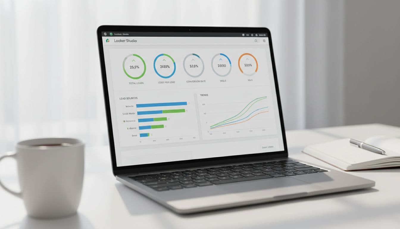
Build the overview page step-by-step (one page your execs will open)
Image prompt suggestion: A laptop showing an overview dashboard with KPI tiles and a weekly trend chart, no readable text.

Think of the overview page, your marketing dashboard, like a car dashboard. It shouldn't explain everything; it should show what needs attention.
Build steps (recommended components):
- Add a Date range control (default: last 28 days) and a Data control if you manage multiple accounts.
- Add 5 to 7 Scorecards: Spend (for budget tracking), Leads, CPL, MQLs, SQLs, Cost per SQL, and (if available) Pipeline value.
- Add a Time series chart: dimension = Date, metrics = Spend and Leads (dual-axis).
- Add a Table called “Top campaigns”: dimension = Campaign, metrics = Spend, Leads, CPL, MQLs, SQLs. Sort by SQLs (desc) for actionable insights.
- Add drill-down on the campaign table: Campaign -> Ad group -> Keyword (Google Ads) or Campaign -> Ad set -> Ad (Meta).
If your conversion setup is still evolving, use this internal guide to stabilize it: track website conversions in Google Analytics. For extra layout ideas, this collection of report templates is useful for page structure.
Lead sources and ad platform breakdown (where CPL rises first)
Image prompt suggestion: A marketer holding a tablet showing stacked bars for leads by channel and a CPL table, no readable text.

This page analyzes cross-channel performance to answer a simple question: which channel is producing real leads at a sane cost?
Build steps (charts that work well):
- Stacked bar chart: dimension = Week (or Date), breakdown dimension = Platform (Google Ads, Facebook Ads, Meta Ads, TikTok Ads, LinkedIn Ads), metric = Leads.
- Bar chart: dimension = Campaign, metric = CPL (use a filter for min spend to avoid tiny-sample noise).
- Scatter chart: X = CPL, Y = Leads, bubble size = Spend, dimension = Campaign (great for spotting waste).
- Detail table: dimensions = Platform, Campaign, Landing page (if available), Instagram Insights; metrics = Spend, Clicks, Leads, CPL, GA4 CVR.
Add cross-filtering so clicking “Meta Ads” updates the whole page. Also include a landing page filter when you can, because one weak form page can make a good campaign look bad.
Blend CRM data for full-funnel tracking (MQL and SQL, not just form fills)
Image prompt suggestion: A desktop screen showing a funnel from clicks to form submits to MQL and SQL, no readable text.
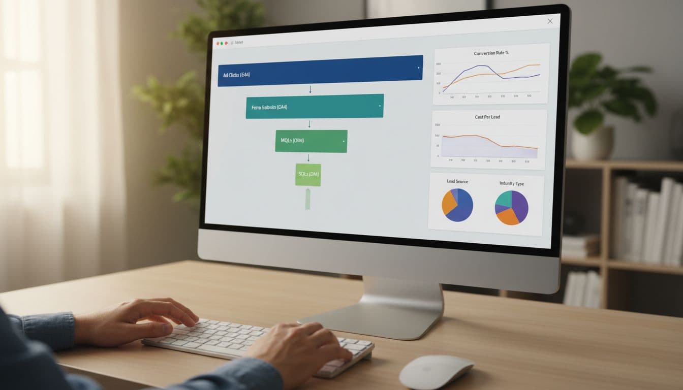
Ad platforms optimize to what you feed them. If you only report form fills, you'll often buy more low-quality leads. This full-funnel approach is essential for both lead gen and ecommerce analytics.
Build steps (a clean join plan using data source connectors):
- In your CRM export, include: Lead ID, Created date, Stage (Lead, MQL, SQL), Source, Campaign, UTM fields, and click IDs (gclid, fbclid) when possible.
- In Google Analytics 4, capture a lead_id on submit (or a stable dedupe key like email hash), plus UTMs.
- In Looker Studio, blend data on Lead ID (best), or on Email (risky), or on Date + Campaign (least accurate).
- Build a funnel chart: metrics = Clicks (Ads), Leads (GA4), MQLs (CRM), SQLs (CRM).
For tracking hygiene that holds up over time, keep this bookmarked: GA4 lead tracking checklist for B2B.
Attribution caveat: CRM stages often happen days later. Use both “lead created date” and “stage change date,” then report with clear labels.
Quick implementation checklist (copy this and ship the template)
Image prompt suggestion: Simple icons showing connectors, charts, blends, and filters as a visual checklist, no readable text.
This checklist helps data analysts create white-label report templates for clients.
Copy this checklist:
- Define lead events in Google Analytics 4 (form_submit, demo_request, click_to_call) and test in DebugView.
- Connect sources using data source connectors: Google Analytics 4, Google Ads, Google Search Console, Meta, Amazon Ads, LinkedIn, Shopify, and CRM (native connector or a clean Sheets export).
- Build 3 pages: Overview, Source and Platform, CRM Funnel.
- Add global controls: Date range, Platform, Campaign, Geo, Device.
- Add drill-downs: Campaign -> Ad group -> Keyword (or Ad set -> Ad).
- Data analysts should verify dedupe rules in CRM exports (one row per Lead ID, latest stage).
- Label metrics clearly (Leads GA4 vs Leads CRM) and document definitions in a small text box.
- Set refresh expectations (15 minutes to daily) based on data source speed.
If you prefer starting from an established layout, this campaign dashboard report template can help you compare page structure before you finalize yours.
Conclusion
A dependable looker studio dashboard template should do one job well: connect spend to pipeline for digital marketing performance. When you standardize KPIs, build a tight overview page, and blend CRM stages, reporting stops being a weekly debate and provides real-time insights for the team.
Set it up once, then improve it monthly. If you want help building a version that matches your exact ad mix and CRM workflow, skip generic free looker studio templates; start with ClickyOwl's performance marketing agency team and make the dashboard part of the campaign process, not an afterthought.